This tutorial will show you some tips on how to use the Pen Tool,
along with some Brushes and Blend Modes, to create a striped road
(street) inspired text effect.
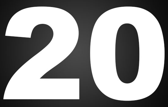
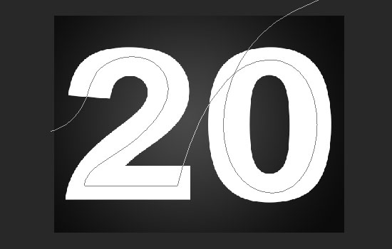
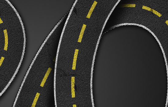
The number 20 is used to demonstrate the basic technique of creating the main text effect, then adding the part at the top where the overlapping of the stroke happens.
Once you get the idea, you can use the same technique with any other text you like.
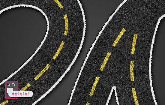
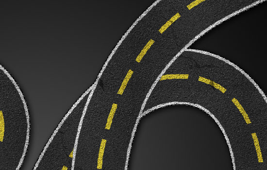
The Final Result:
 Notes:
* the software used in this tutorial is Adobe Photoshop CS6, but you can use CS3+ versions as well.
* you might want to check the Basix Page to see some useful topics on dealing with Photoshop basics, such as loading palettes and some shortcuts.
Resources:
* Gun metal pattern by Nikolay Boltachev.
* Asphalt and Lines Patterns by bosanza.
* Grunge Scratches by struckdumb.
Note: You might need to load the Contours used in the tutorial, so check this image to see how to do so.
Step 1
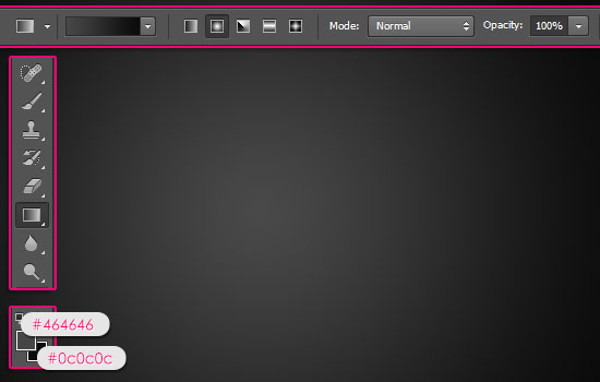
- Create a new 1156 x 864 px document. Set the Foreground color to #464646 and the Background color to #0c0c0c. Pick the Gradient Tool, choose the Foreground to Background, Radial Gradient, in the Options bar. Then click and drag from the center of the document to one of the corners to create the Background gradient.
 - Create the text in white using a big bold font. The font used here is Arial Black.
Now this will be only used as a reference, so if you can create the text as a work path without a reference skip this step.
One more thing to keep in mind is the size of the text. The more letters you have, the narrower the street will look, unless you increase the canvas size.
 Step 2
- Once you’re done modifying your text, pick the Pen Tool. In the Options bar, choose the Path option.
A click will give you a (sharp) anchor point, while a click and a drag will create a curve.
So use that to create the text path, starting from one edge and ending at another (the start and end points should not be floating inside the canvas). And keep the path continuous, even between the separate letters.
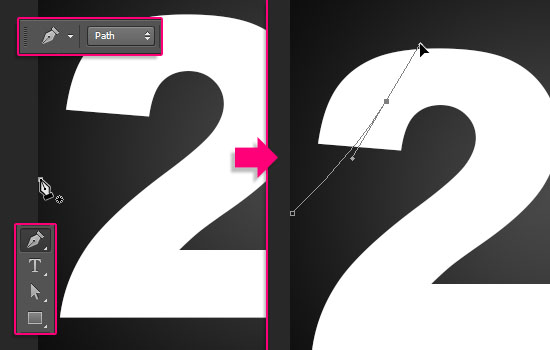 - Don’t worry about making the path perfect, we’ll work on it in a bit. Just make sure to create the basic path shape.
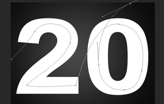 - Pick the Direct Selection Tool, then start modifying the path. You
can click and drag an anchor point to move it around, or you can click
the Direction Points at the end of the two Direction Handles, then move
them around to change the orientation of the curve, or drag them
outwards and inwards to make the curve wider or narrower.
- Pick the Direct Selection Tool, then start modifying the path. You
can click and drag an anchor point to move it around, or you can click
the Direction Points at the end of the two Direction Handles, then move
them around to change the orientation of the curve, or drag them
outwards and inwards to make the curve wider or narrower.
You can use the Add/Delete Anchor Point Tool(s) if needed as well.
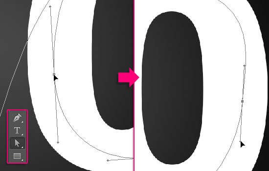 - The path should look smooth and flow between the letters without so many overlaps.
 Step 3
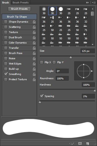
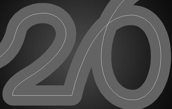
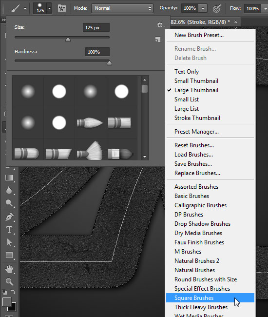
- Pick the Brush Tool and open the Brush panel (Window -> Brush). Choose a hard round brush, set its Size to 125, and the Spacing to 1%.
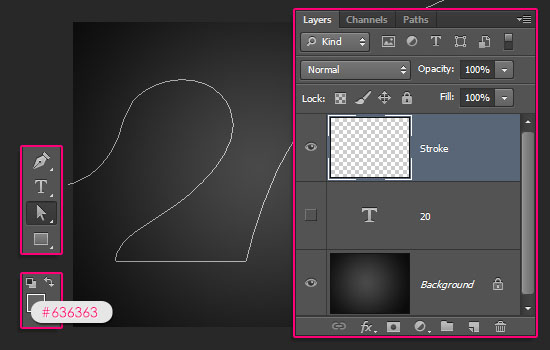
 - Set the Foreground color to #636363, create a new layer on top of
the text layer and call it “Stroke”, then make the text layer invisible
(by clicking the eye icon next to it), and pick the Direct Selection
Tool.
- Set the Foreground color to #636363, create a new layer on top of
the text layer and call it “Stroke”, then make the text layer invisible
(by clicking the eye icon next to it), and pick the Direct Selection
Tool.
 - Right click the work path and choose Stroke Path. Then choose Brush
from the Tool drop down menu and un-check the Simulate Pressure box.
- Right click the work path and choose Stroke Path. Then choose Brush
from the Tool drop down menu and un-check the Simulate Pressure box.
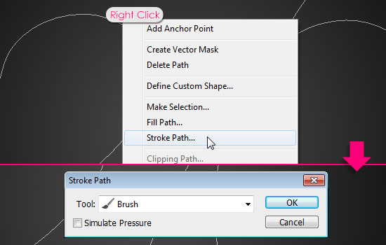 - This will stroke the path with the brush.
 Step 4
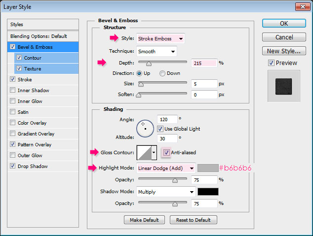
Double click the “Stroke” layer to apply the following Layer Style:
- Bevel and Emboss: Change the Style to Stroke Emboss, the Depth to 215, check the Anti-aliased box, change the Highlight Mode to Linear Dodge (Add), and its color to #b6b6b6.
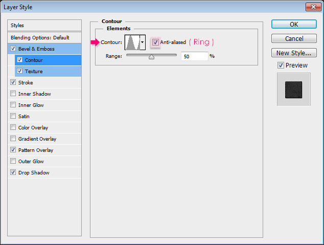
 - Contour: Choose the Ring contour, and check the Anti-aliased box.
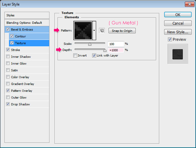
 - Texture: Choose the “Gun Metal” Pattern, and change the Depth to 1000%.
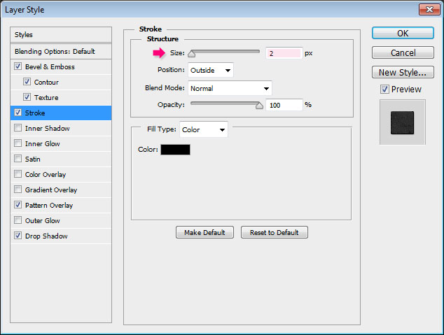
 - Stroke: Just change the Size to 2.
 - Pattern Overlay: Choose the “Asfalto3″ Pattern from the patterns pack, and change the Scale to 25%.
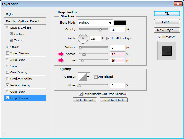
 - Drop Shadow: Change the Spread to 17 and the Size to 16.
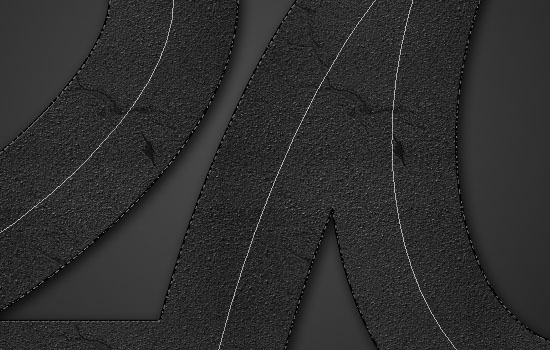
 - This will create the main asphalt road effect.
 Step 5
- Pick the Brush Tool, then, in the Options bar, click the Brush Preset Picker arrow, then open the pop-up menu, and choose the “Square Brushes” down the list. When you get a dialog box after that, just click Append, and this will add a set of square brushes to you brush preset.
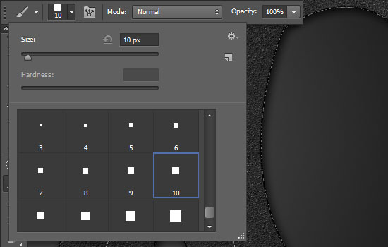
 - Choose the 10 px square brush, then open the Brush panel.
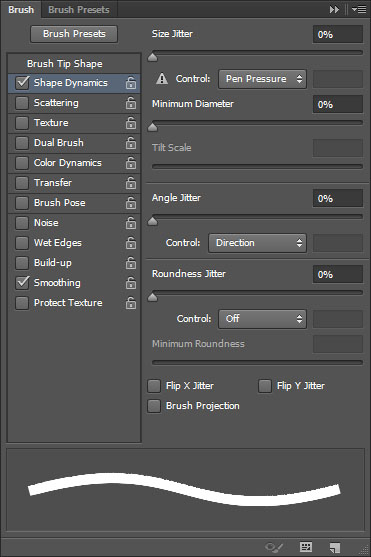
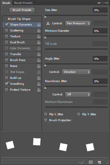
 - Under Shape Dynamics, set the Angle Jitter Control to Direction.
This will rotate the brush tip in the direction of the path (curve), so
that it will maintain the same thickness along the path.
- Under Shape Dynamics, set the Angle Jitter Control to Direction.
This will rotate the brush tip in the direction of the path (curve), so
that it will maintain the same thickness along the path.
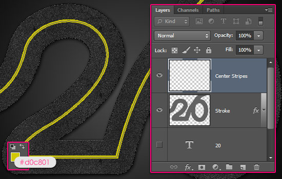
 - Set the Foreground color to #d0c801, create a new layer on top of
all layers and call it “Center Stripes”, then stroke the path with the
modified square brush.
- Set the Foreground color to #d0c801, create a new layer on top of
all layers and call it “Center Stripes”, then stroke the path with the
modified square brush.
(Tip: Another faster way to stroke the path, is to have the Brush Tool active, then hit the Enter/Return key).
 - Now pick the Eraser Tool, choose the 24 px square brush, then open
the Brush panel. Under Brush Tip Shape, set the Spacing to a value
around 380%.
- Now pick the Eraser Tool, choose the 24 px square brush, then open
the Brush panel. Under Brush Tip Shape, set the Spacing to a value
around 380%.
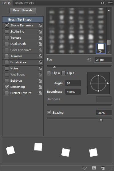 - Under Shape Dynamics, set the Angle Jitter Control to Direction as well.
 - Stroke the path with the Eraser Tool.
You can either right click the path, choose Stroke Path, then choose Eraser instead of Brush from the Tool drop down menu. Or, once again, by simply having the Eraser Tool active, then hitting the Enter/Return key.
you can try some different Spacing values for the Eraser brush tip if you don’t like the result, or if you want longer or shorter lines.
Once you like the result, pick the Direct Selection Tool, then hit Enter/Return to get rid of the work path.
 - This will create separate lines. Now you’ll notice that there is a
problem where the original path overlaps. So you can go ahead and erase
that part. We will fix it later in the tutorial.
- This will create separate lines. Now you’ll notice that there is a
problem where the original path overlaps. So you can go ahead and erase
that part. We will fix it later in the tutorial.
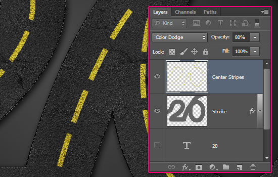
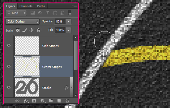
 - Change the “Center Stripes” layer’s Blend Mode to Color Dodge, and
its Opacity to 80%. This will blend the lines with the street to make
things more realistic.
- Change the “Center Stripes” layer’s Blend Mode to Color Dodge, and
its Opacity to 80%. This will blend the lines with the street to make
things more realistic.
 Step 6
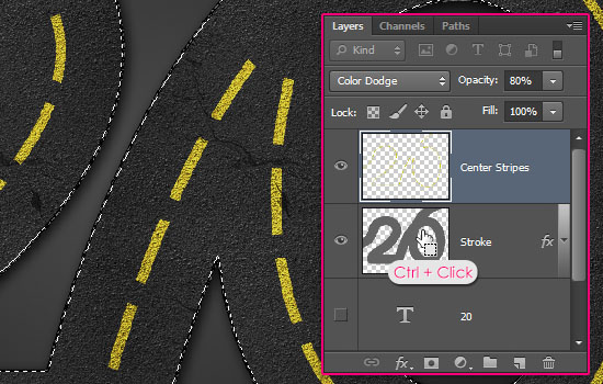
- Ctrl + click the “Stroke” layer’s thumbnail to create a selection.
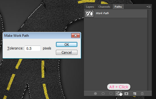
 - Open the Paths panel (Window -> Paths), then press and hold the
Alt/Option key, and click the “Make work path from selection” icon down
the panel.
- Open the Paths panel (Window -> Paths), then press and hold the
Alt/Option key, and click the “Make work path from selection” icon down
the panel.
This will open a dialog box to enter a Tolerance value. Lower values create more precise paths, so set it to 0.5.
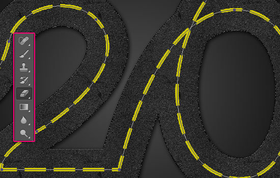
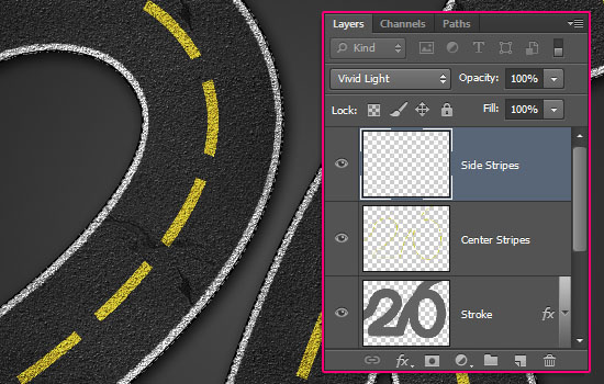
 - The selection is now converted to a work path. Create a new layer on top of all layers and call it “Side Stripes”.
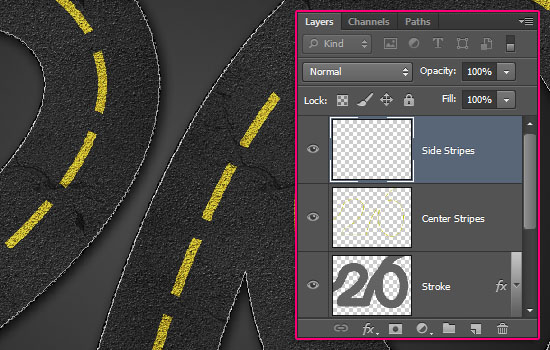 - Set the Foreground color to #e1e1e1, then stroke the path withe the same 10 px square brush used before.
Hit the Enter/Return to get rid of the work path, then create a selection from the “Stroke” layer one more time.
Go to Select -> Inverse, then hit the Delete key to remove the outer part of the edge stripes.
 - Go to Select -> Deselect, then change the “Side Stripes” layer’s Blend Mode to Vivid Light.
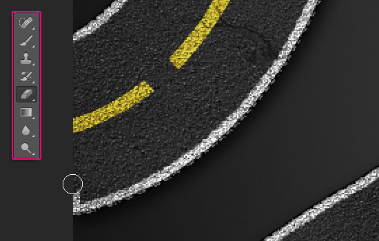
 - Use the Eraser Tool to remove the parts of the stroke that meet the edges of the canvas.
 Step 7
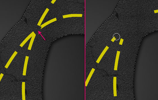
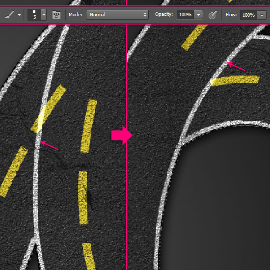
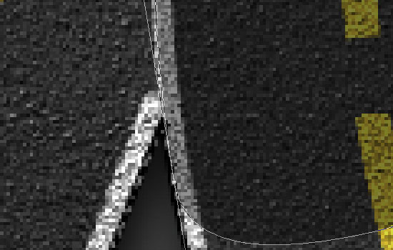
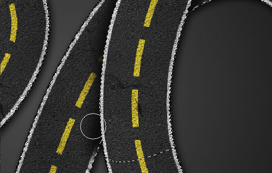
- This is the tricky part, in which the overlappinng area will be fixed. Use the Pen Tool to create the curve between the two points where the overlapping happens. Create the path from the center of the start point to the center of the end point.
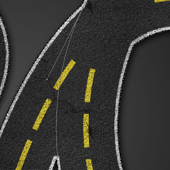 - Stroke the path with a 5 px square brush tip (with the Angle Jitter
Control set to Direction). You might need to adjust the path or change
the brush size a couple of times. So just take your time, and stroke all
the sides wherever there is an overlap.
- Stroke the path with a 5 px square brush tip (with the Angle Jitter
Control set to Direction). You might need to adjust the path or change
the brush size a couple of times. So just take your time, and stroke all
the sides wherever there is an overlap.
 - Click the “Center Stripes” layer, then use hard round brush tip for
the Eraser Tool to delete the yellow stripes that intersect with the
white ones.
- Click the “Center Stripes” layer, then use hard round brush tip for
the Eraser Tool to delete the yellow stripes that intersect with the
white ones.
 - There should be no more overlapping parts now.
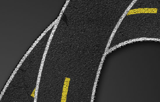 - The one thing left is the empty area where there should be yellow lines.
Erase all the yellow stripes that follow the empty area, then create a path to re-add them like you did in Step 5.
 - That’s it for the stripes.
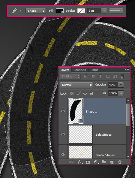
 Step 8
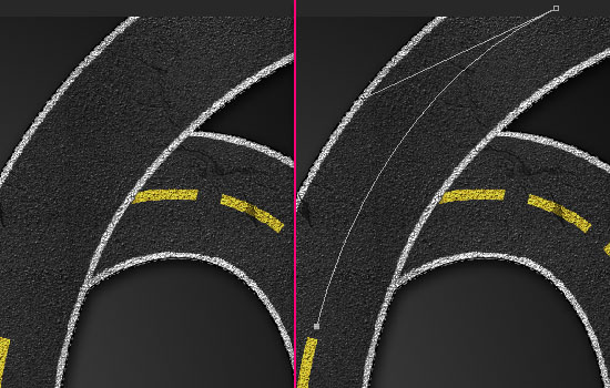
- The last thing to add, is some shadow to give an illusion that the top part is actually on top.
Pick the Pen Tool, and choose the Shape option in the Options bar.
Create a shape that covers the top area of the street, and make it as precise as possible.
Also, extend it a bit more at the sides (top and bottom in the picture below) so that the shadow won’t be added to unwanted areas. You’ll get what this means in a second.
You can decrease the Shape layer’s Opacity value to see the original image clearer.
 - Make sure to trace the exact original curve.
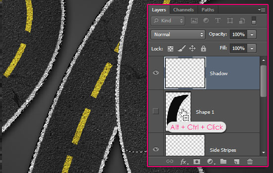
 - Once the curve is created, Ctrl + Click the “Stroke” layer’s
thumbnail to create a selection, then, Alt + Ctrl + Click the Shape
layer’s thumbnail to subtract it from the selection.
- Once the curve is created, Ctrl + Click the “Stroke” layer’s
thumbnail to create a selection, then, Alt + Ctrl + Click the Shape
layer’s thumbnail to subtract it from the selection.
Create a new layer on top of all layers and call it “Shadow”, then make the shape layer invisible.
 - Choose a soft round brush, set the Foreground color to Black (or a dark color), then start painting some shadows where needed.
This is where the importance of extending the shape’s side shows: It prevents the shadow from being added to the upper part of the street.
 - Deselect when done.
 Step 9
- Place the texture image right on top of the Background layer, then change its Blend Mode to Soft Light.
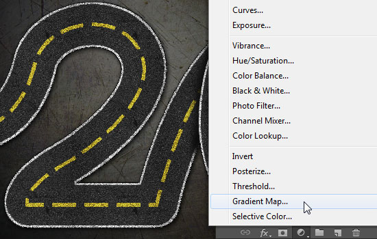
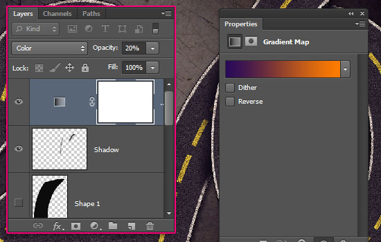
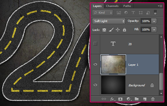 - Click the “Create new fill or adjustment layer” icon down the Layers panel, and choose Gradient Map.
 - Place the adjustment layer on top of all layers, change its Blend
Mode to Color, and its Opacity to 20%. Then choose Photoshop’s default
gradient “Violet, Orange”.
- Place the adjustment layer on top of all layers, change its Blend
Mode to Color, and its Opacity to 20%. Then choose Photoshop’s default
gradient “Violet, Orange”.
 That’s it!
The number 20 is used to demonstrate the basic technique of creating the main text effect, then adding the part at the top where the overlapping of the stroke happens.
Once you get the idea, you can use the same technique with any other text you like.
The Final Result:

* the software used in this tutorial is Adobe Photoshop CS6, but you can use CS3+ versions as well.
* you might want to check the Basix Page to see some useful topics on dealing with Photoshop basics, such as loading palettes and some shortcuts.
Resources:
* Gun metal pattern by Nikolay Boltachev.
* Asphalt and Lines Patterns by bosanza.
* Grunge Scratches by struckdumb.
Note: You might need to load the Contours used in the tutorial, so check this image to see how to do so.
Step 1
- Create a new 1156 x 864 px document. Set the Foreground color to #464646 and the Background color to #0c0c0c. Pick the Gradient Tool, choose the Foreground to Background, Radial Gradient, in the Options bar. Then click and drag from the center of the document to one of the corners to create the Background gradient.
Now this will be only used as a reference, so if you can create the text as a work path without a reference skip this step.
One more thing to keep in mind is the size of the text. The more letters you have, the narrower the street will look, unless you increase the canvas size.
- Once you’re done modifying your text, pick the Pen Tool. In the Options bar, choose the Path option.
A click will give you a (sharp) anchor point, while a click and a drag will create a curve.
So use that to create the text path, starting from one edge and ending at another (the start and end points should not be floating inside the canvas). And keep the path continuous, even between the separate letters.
You can use the Add/Delete Anchor Point Tool(s) if needed as well.
- Pick the Brush Tool and open the Brush panel (Window -> Brush). Choose a hard round brush, set its Size to 125, and the Spacing to 1%.
Double click the “Stroke” layer to apply the following Layer Style:
- Bevel and Emboss: Change the Style to Stroke Emboss, the Depth to 215, check the Anti-aliased box, change the Highlight Mode to Linear Dodge (Add), and its color to #b6b6b6.
- Pick the Brush Tool, then, in the Options bar, click the Brush Preset Picker arrow, then open the pop-up menu, and choose the “Square Brushes” down the list. When you get a dialog box after that, just click Append, and this will add a set of square brushes to you brush preset.
(Tip: Another faster way to stroke the path, is to have the Brush Tool active, then hit the Enter/Return key).
You can either right click the path, choose Stroke Path, then choose Eraser instead of Brush from the Tool drop down menu. Or, once again, by simply having the Eraser Tool active, then hitting the Enter/Return key.
you can try some different Spacing values for the Eraser brush tip if you don’t like the result, or if you want longer or shorter lines.
Once you like the result, pick the Direct Selection Tool, then hit Enter/Return to get rid of the work path.
- Ctrl + click the “Stroke” layer’s thumbnail to create a selection.
This will open a dialog box to enter a Tolerance value. Lower values create more precise paths, so set it to 0.5.
Hit the Enter/Return to get rid of the work path, then create a selection from the “Stroke” layer one more time.
Go to Select -> Inverse, then hit the Delete key to remove the outer part of the edge stripes.
- This is the tricky part, in which the overlappinng area will be fixed. Use the Pen Tool to create the curve between the two points where the overlapping happens. Create the path from the center of the start point to the center of the end point.
Erase all the yellow stripes that follow the empty area, then create a path to re-add them like you did in Step 5.
- The last thing to add, is some shadow to give an illusion that the top part is actually on top.
Pick the Pen Tool, and choose the Shape option in the Options bar.
Create a shape that covers the top area of the street, and make it as precise as possible.
Also, extend it a bit more at the sides (top and bottom in the picture below) so that the shadow won’t be added to unwanted areas. You’ll get what this means in a second.
You can decrease the Shape layer’s Opacity value to see the original image clearer.
Create a new layer on top of all layers and call it “Shadow”, then make the shape layer invisible.
This is where the importance of extending the shape’s side shows: It prevents the shadow from being added to the upper part of the street.
- Place the texture image right on top of the Background layer, then change its Blend Mode to Soft Light.
No comments:
Post a Comment